Monday, 10 January 2011
Poco model
(Watch in HD)
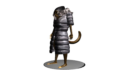
So here it is. My concept of the character Pocahuntas Billiams. I'm quite pleased with it but at the same time I wish I had a little more time on it to figure a few things out. One thing that I think has annoyed me the most is trying to get it to rig properly.
Almost there
My Maya has crashed 6 times now while iv'e been trying to add lighting and such but I think iv'e finally got it..
I think..
I think..
Trying to Rig
Now on to rigging..
I tried making a rig for my rat in my other project so I kinda know what I'm doing. The only problem is that the rig my my rat failed miserably..but saying that, it was for a quadruped rig not a human rig, so this may be a bit easier. I'm not really looking forward to this at all in the slightest but all I can do is try.
Well iv'e got a auto rig tool from a website called CreativeCrash and it doesn't seem to be as bad as I thought. I just need to move the points into the correct sections and it should all be fine. Also I used another rig from the same site, but it failed miserably but this is looking up.
Yay! The tool works pretty well and creating my characters rig was a lot easier than I thought. The only problem iv'e had while doing it is that my graphics card driver keeps messing up.. so it makes Maya close every time I get anywhere near finishing the rig. I'm here now so I am so happy.. finally..
Finally my character rigged and posed.. the only problem I have had is that iv'e realized I didn't make a rig for the tail of the character.. SO! it means that the rig as it is merged part of the spine to the tail and it I try to move it too far, the tail distorts horrendously. Also the knee joints are facing the wrong way for some reason, but if I'm honest, I didn't give my self enough time to figure out why it was doing that, so that's my fault.
I have to say all in all though, I'm happy ^_^
textureing
Oh joy, the fun of texturing >_>
OK well since I have some ideas in mind it shouldn't hopefully be to bad. for the character it self I was thinking block colours, as its suppose to look like clay but at the same time I don't want my model to look too plane. What i have in mind is that i want my characters skin to look like clay but the clothes to have a bit more detail to them, lets see how it goes though.
The first colour that came to mind was blue, I think I was inspired from some work I saw from a past Ravensbourne student so I tried it but I don't think it fits my character to what I had in mind. I want this to be my character rather than a character totally based on others ideas, so I think I will stick to the original colour in my head which was brown, just because I think this portrays that the character is a monkey more than anything.
This is the UV map of my model that I have created by selecting the entire character then creating UV's from the camera in a front view. I then picked of certain bits that I felt needed to be a different colours in face mode and moved the camera to the right view to create another UV for that part. I knew doing it this way could cause distortion in most cases but for block colours it would be fine as long as no major detail is added.
I also left out the eyes because I wanted them as black circles so I just selected the faces and applied a black blinn texture to it.
For the clothes it was pretty much the same process as the skin but instead, I used a selection of source images to put it together. The main thing I wanted to make sure was noticed was the silver tape on her back, representing the idea of imitating a silver back gorilla.
Once I applied my textures this is how my model looked, and I have to say I was pleasantly surprised with it. I don't see my self as much of a texture artist but once I got my head around it, I found it a lot easier than I originally thought. I still think there is a better way of going about it than I did though, it's just trying to find out what suits me best and looks the best I guess.
lol I just rhymed :P
modeling
This is my final model after tedious modelling and picking at it, I have a model that I'm happy to say is good enough for texturing and rigging. I just hope that I can give it some justice in those departments.
I was stuck for thought on how I was going to create the fur on the jackets collar as well as try and keep it in the correct theme of the project but once again the duplicate poly tool saved me. I grabbed the polygons around the neck of my character duplicated them and then extruded them upwards. once this was done, I subdivided the object into individual squares with crosses in the middle and pulled that centre vertex out to create a spike. Repeated, this gave me as close to fur as I thought you could get from a clay model. I'. quite proud of it actually :P
To create the jacket, I have just decided to would be best to select using the face tool and duplicate the faces. Once that is done I scaled it and modelled it a bit until it looked about the right shape. I then selected the entire jacked and extruded the faces outwards to get the bomber jacket kind of look that I wanted. When it's smoothed over its just right for what I want, to keep that plasticine/clay kinda look to it.
I tried first to make clothes using this tutorial: http://www.3dm3.com/tutorials/maya/cloths/
but I have found that since it was made, many things have changed in Maya and due to that, the cloth panel has been replaced by the ncloth, which works a totally different way.
I'm finally happy enough to mirror the geometry across the -x to have a full model and I have to say that I'm pretty happy with it. When i first mirrored my image for some reason the poly-mirror was translating across from the tail rather than the mid point but i just changed that in the attribute editor afterwards.
I have also manipulated the face a bit to match my reference image as I don't think i have the time to set-up and get a face rig working.
I have created the detail for my hand now as well and once again I think it has come out pretty decent for the first hand i have ever modelled. The only thing I'm thinking is that when it comes to rigging, the position of the hand may be a problem but I guess I will see.
I created a cube originally for the head and matched vertices, merged objects, merged vertices and then sub-divided for detail to create the face. I have to say I think its come out pretty well and its not to messy either. I think that I'm really starting to enjoy modelling.
I have to say I like the look of it smoothed over, but still MORE WORK TO GO!
I have now finished the basic model of my character and I have to say I'm pretty pleased with how its looking so far. Now I just need to start putting some detail into certain area's such as the hand and face.
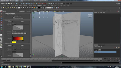
I have corrected my reference image now using guide lines to match up the proportions (Which I should have done in the first place) and I am going to continue modelling. My model isn't to badly out of proportion due to the reference images but now its back in good shape and ready to continue.
I have carried on modelling my character but its come to my attention that my reference images don't match up in size so I have been trying to match up the proportions of two different sized images for a single character.
Subscribe to:
Comments (Atom)


